
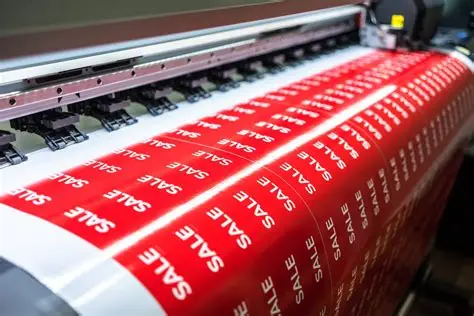
A well-designed label can make the difference between a product that sells and one that sits on the shelf.
Typography First Choose fonts that are legible at small sizes and consistent with your brand identity. Avoid using more than two or three font families on a single label.
Color Psychology Colors communicate before the consumer reads a single word. Red signals energy and passion. Green signals nature and sustainability. Blue signals trust and reliability. Choose intentionally.
Finish Options Matte finishes feel premium and reduce glare. Gloss finishes are vibrant and eye-catching. Soft-touch finishes are velvety and luxurious. Foil stamping adds a metallic, high-end element.
Size and Shape Don't default to standard rectangles. Die-cut labels in custom shapes can dramatically increase shelf standout.
Material Selection Paper labels are cost-effective. Vinyl labels are waterproof and durable. Clear labels give a "no-label" look that works beautifully on glass and clear plastic containers.
Work with a Professional Our in-house design team can create print-ready artwork from scratch. Share your brief and brand guidelines, and we'll handle the rest.